![]()
Online healthcare marketing platform that helps doctors, hospitals, and health systems manage their online reputation.
brand identity, user research, user testing, creative direction, visual design, development
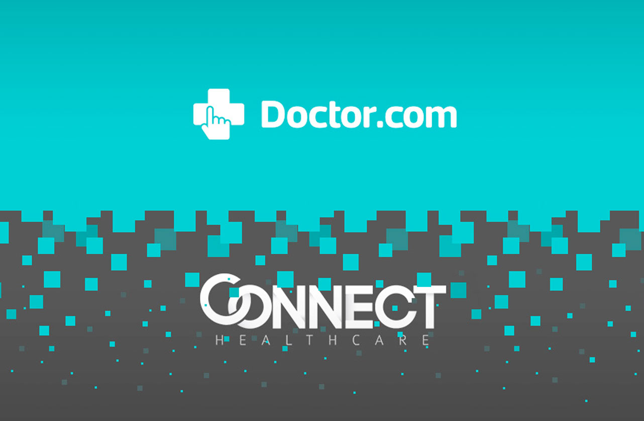
In 2017, Doctor.com merged with Connect Healthcare. As Senior Creative Director, I was in charge of updating the brand identity that would reflect the new company.

Mobile first!


overview.
With two companies coming together, I quickly realized the enormity of our project.
Doctor.com is based in NY, Connect Healthcare in Atlanta. The former focused on individual doctors and private practice, while the latter dealt with enterprise and large-scale health systems. Offices are located in NY, Cupertino, Argentina, India, Arizona, Seattle, and Atlanta. We needed a new logo, website, contracts, business cards, conference materials, and more. With our merger getting announced at a healthcare conference four months away, we had our work cut out for us.
getting on the same page.
It’s hard enough to get 2 people to agree, we had 30.
The entire leadership team met up in NY for a melding of the minds. I needed to get everyone pointed in the same direction before we left for the week. I held breakout sessions and ran a modified Google design sprint to streamline the decision process.
We were able to walk away with a couple design directions, timelines, initiatives, epics, and user stories.
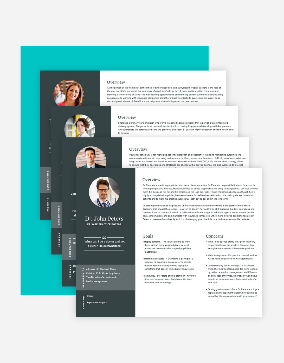
personas.
People ignore design that ignores people.
I wanted to make sure my newly expanded team, the two sides of the company, and myself, understood who we were designing for. I pulled together our existing enterprise personas and got interviewing customers of doctor.com.
“Logos are a graphic extension of the internal realities of a company.”
– SAUL BASS
logo.
When two become one.
The logo needed to convey many messages. The merging of two companies, healthcare, and innovation, while making sure that it didn’t differ too much from the existing brand. After much experimentation, we finally settled on a design that evokes all of this. The medical cross was brought over from the old logo while the lines emphasize the joining of the companies and the end-to-end service that the new company is able to provide.
final direction & style guide.
.
After testing multiple directions, we finally agreed on a clean, minimal approach to show professionalism and stability, while interjecting bright colors and iconography as a nod to our innovative, start-up roots.
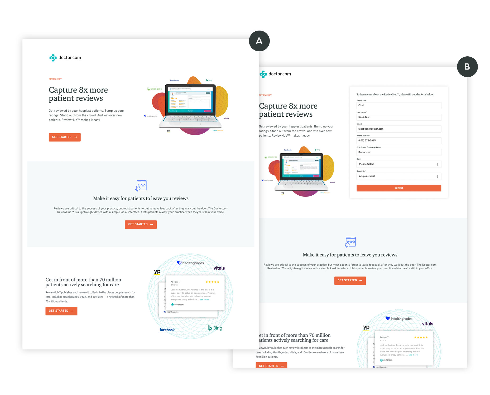
new website.
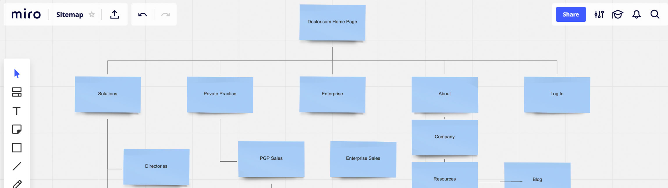
merging two company sites with thousands of pages.
After nailing down the brand identity and handing off to the team to implement, it was time to get started on the new website. We started by card sorting and creating site maps in miro. We based what to include based on a features matrix, relevance of content, and how much traffic the pages had previously gotten.
- Card Sorting
- Analytics Review & User flows
- Features matrix
- Site maps
- User and employee interviews
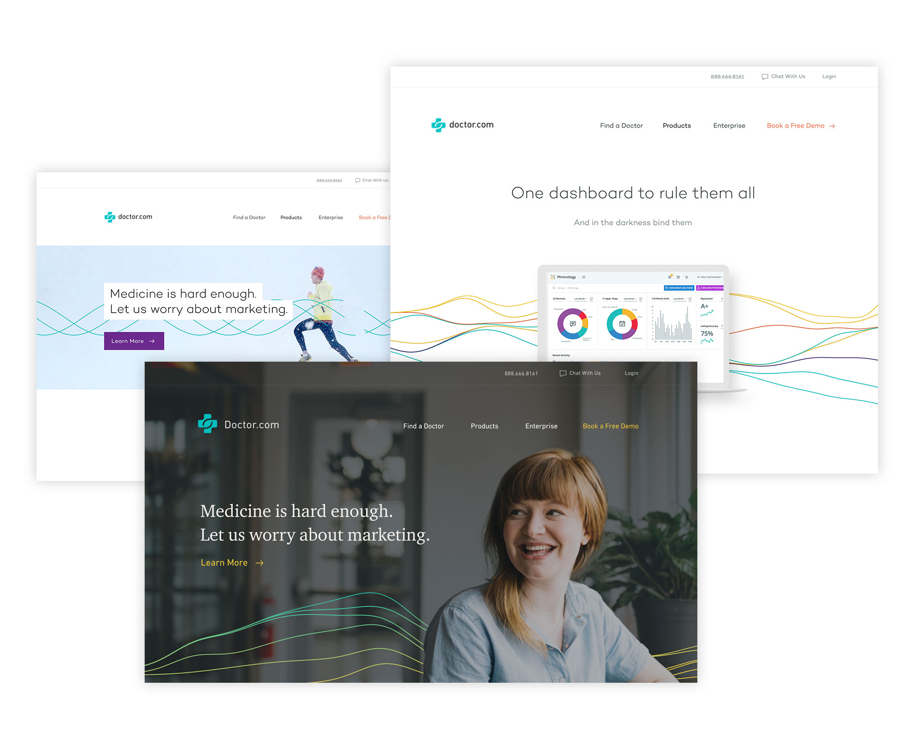
visual exploration.
After nailing down the information architecture and general layout of the site, we explored many different options applying our new brand. I created prototypes and did informal focus groups to gauge public perception of each option.
user testing, final design, & implementation.
We ran the designs through testing with existing clients on both sides, and through usertesting.com. After making final adjustments based on the feedback, it was time to start coding. At this point we only had a month left before we had to go live. It was myself and one other developer building the entire front-end. Instead of cutting corners, we built a hand-coded wordpress theme from scratch that met all of our business priorities.