Provider Connections
For the first time, healthcare organizations can manage provider data, search, online listings, patient feedback analysis, reputation monitoring, transparency, and online scheduling — all from one unified platform.
ux research, user testing, creative direction, ux management, visual design, interaction design, prototyping, development
By far my most ambitious project to date. My goal was to merge multiple products and services into the first truly holistic healthcare offering in a market plagued by fragmented solutions.

Seriously complex data

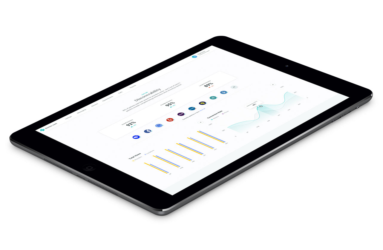
Reputation management

Dashboard
getting started.
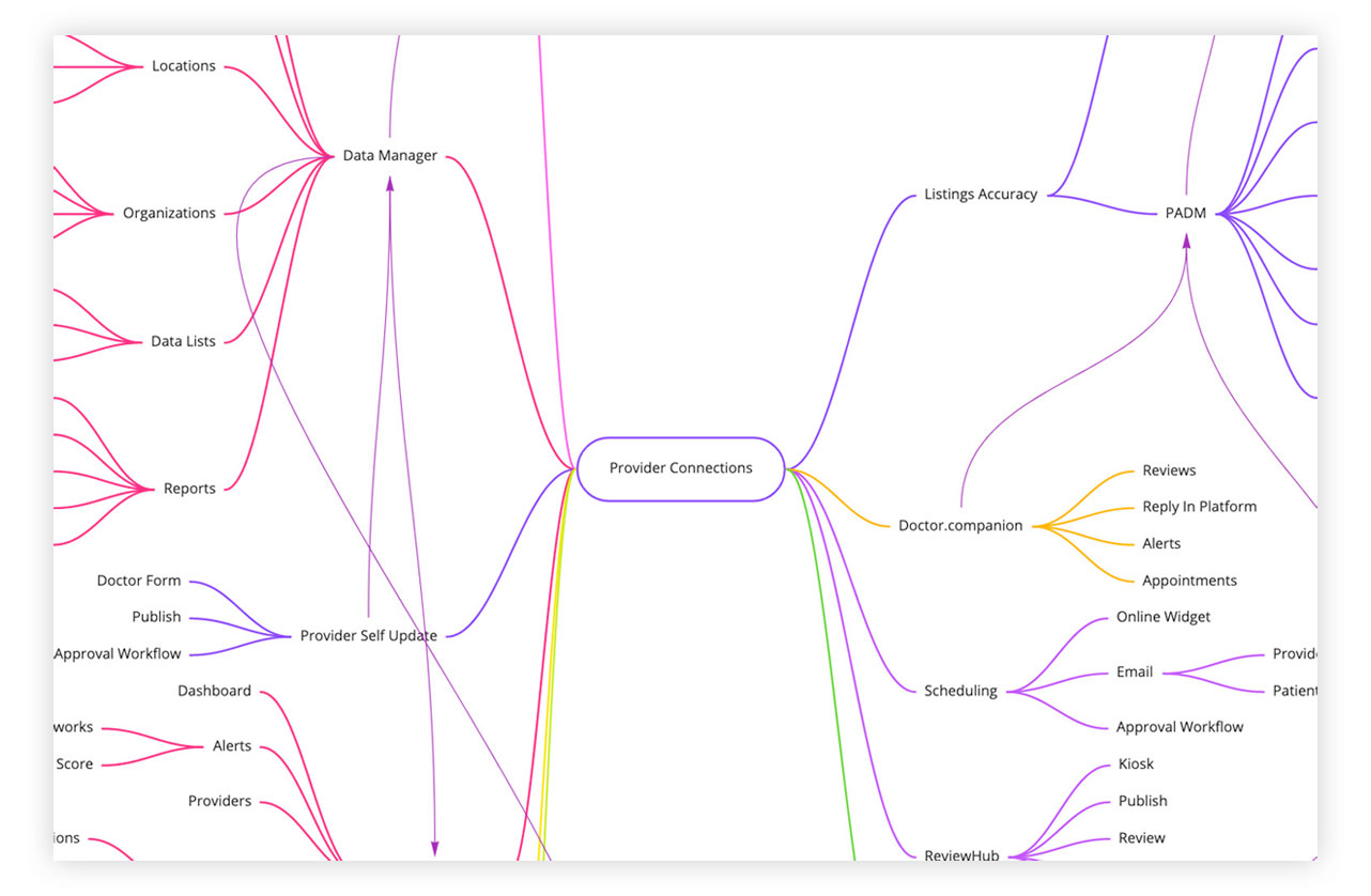
We started with a mind map exercise with heads from each product team to map out our current offerings. This allowed us to see where we were duplicating functionality, how the products relate to each other, and where we can streamline user flows.
understanding the user.
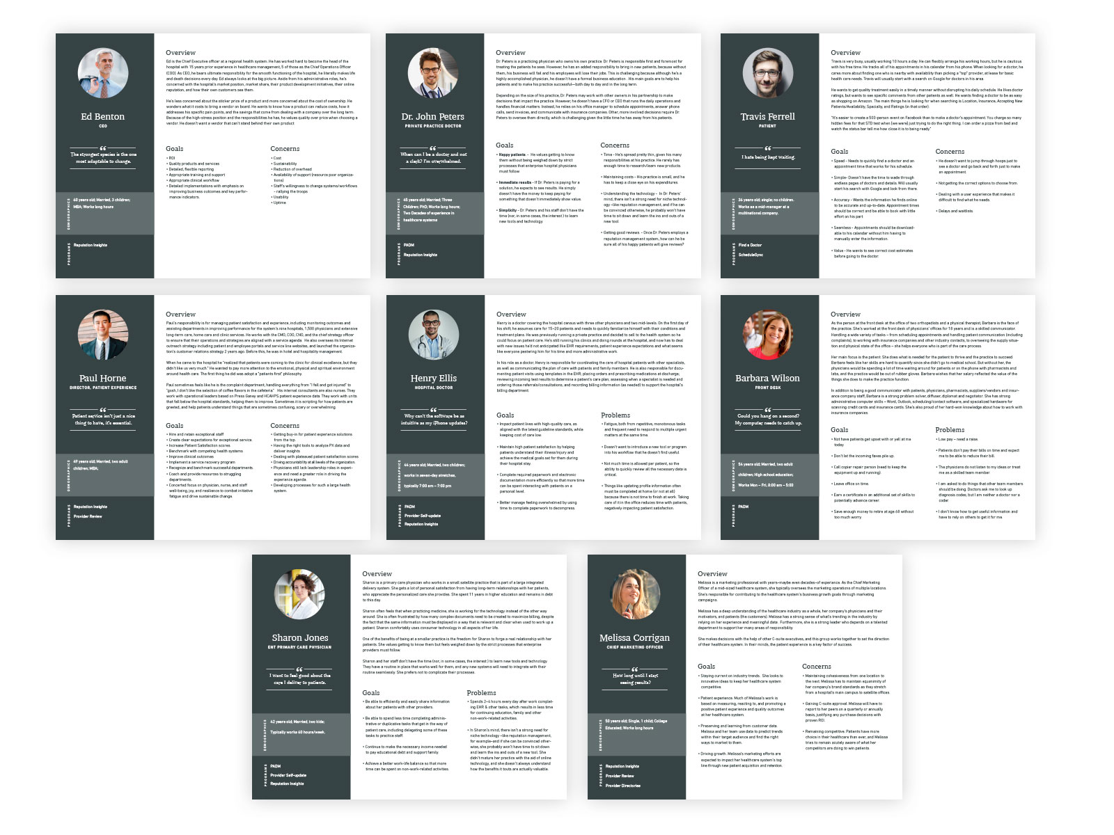
With our product covering private practice all the way to enterprise health systems, we really needed to understand our many users. We conducted interviews with our existing clients on both sides to get to know them better, discover what jobs they needed to accomplish, and what their pain points were. We used this information to build robust user personas.
test the existing solutions.
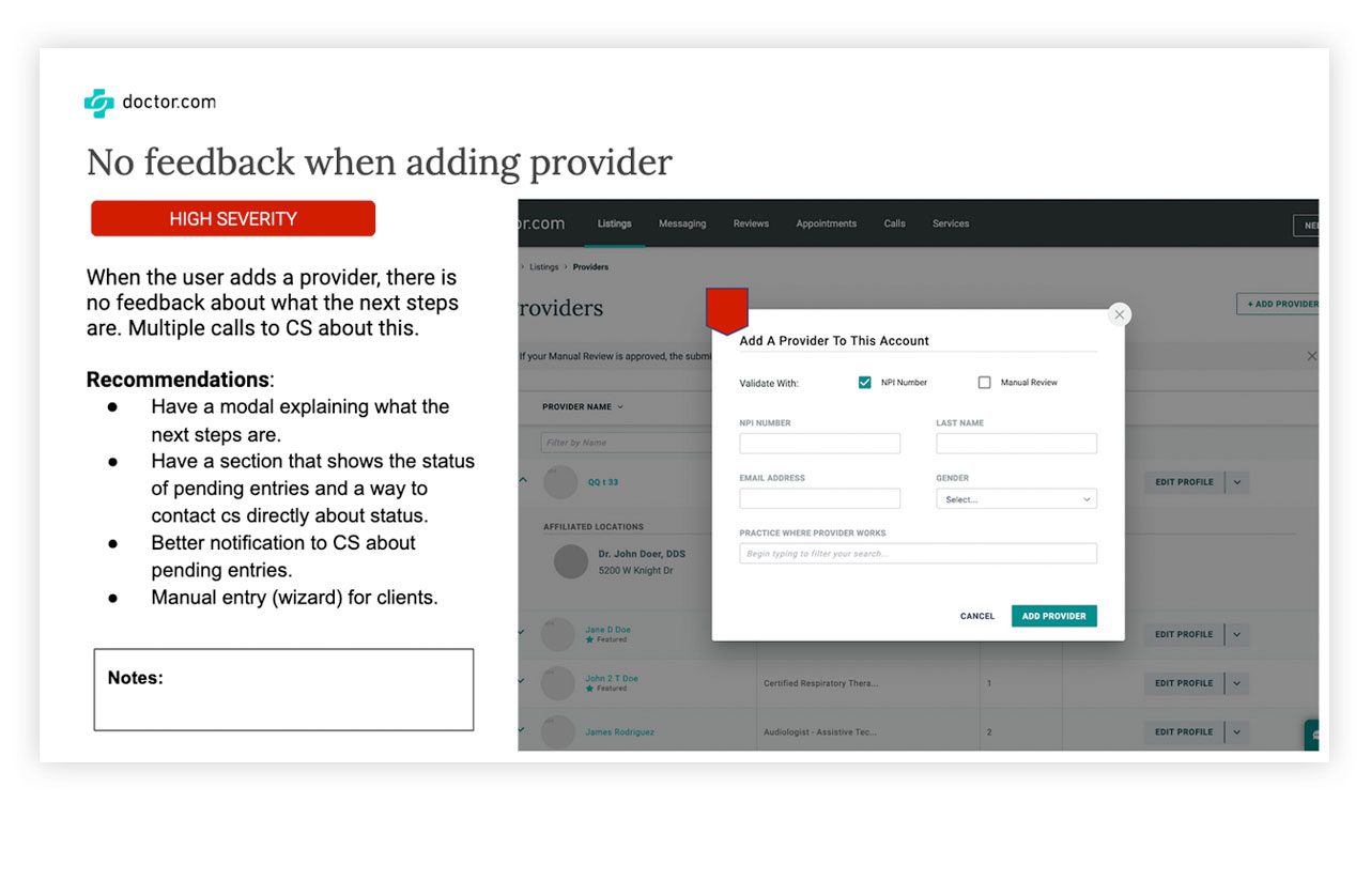
Before we started designing anything, we wanted to see what issues existed in the current solutions. This allowed us to see what was successful to bring over and what didn’t work currently. This also helps to persuade stakeholders that think a current solution is the best. Showing a few videos of users struggling to use the product can do wonders to change opinions.

After completing all the research, we embarked on a one week design sprint. Enter the Thunderdome.
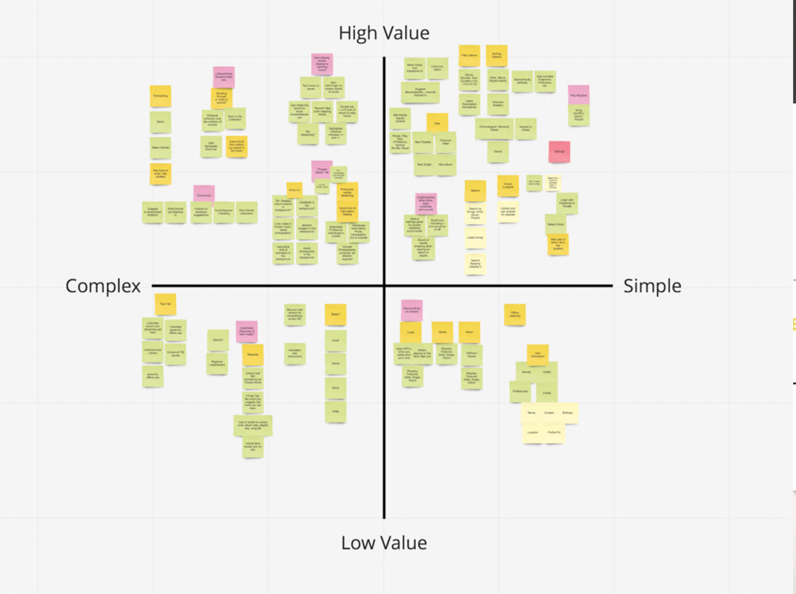
feature prioritization.
Time to clean house and prioritize for the MVP, for this we used a prioritization matrix. A prioritization matrix is a 2D-visual that shows the relative importance of a set of items based on two weighted criteria.
One of the hardest parts about prioritizing features is that they aren’t just product decisions. They’re personal ones. Every single feature, angle, approach, and idea reflects someone’s hard work and opinion. This breaks it down into a more analytical view and makes the stakeholder defend their request. Features that don’t make it to MVP can be placed in the backlog for later releases.
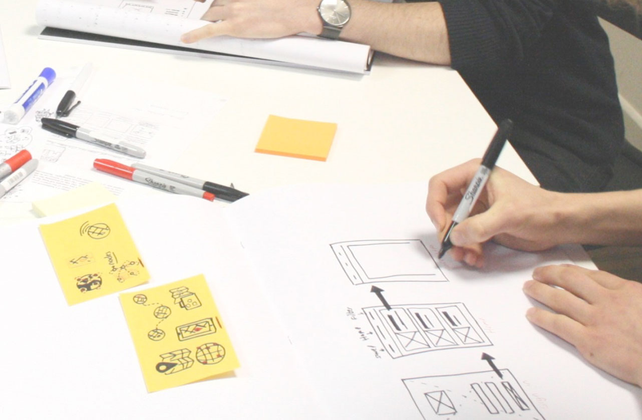
break out the paper and sharpies.
A great way to get stakeholders from different departments involved is low-fi paper prototyping. If the person really can’t draw, they can just write a few words on post-its. The goal here is to encourage rapid iteration and get as many ideas as possible without getting tied to one. Everyone left this exercise feeling like they had a part in the initial development of ideas and that their voice was heard.
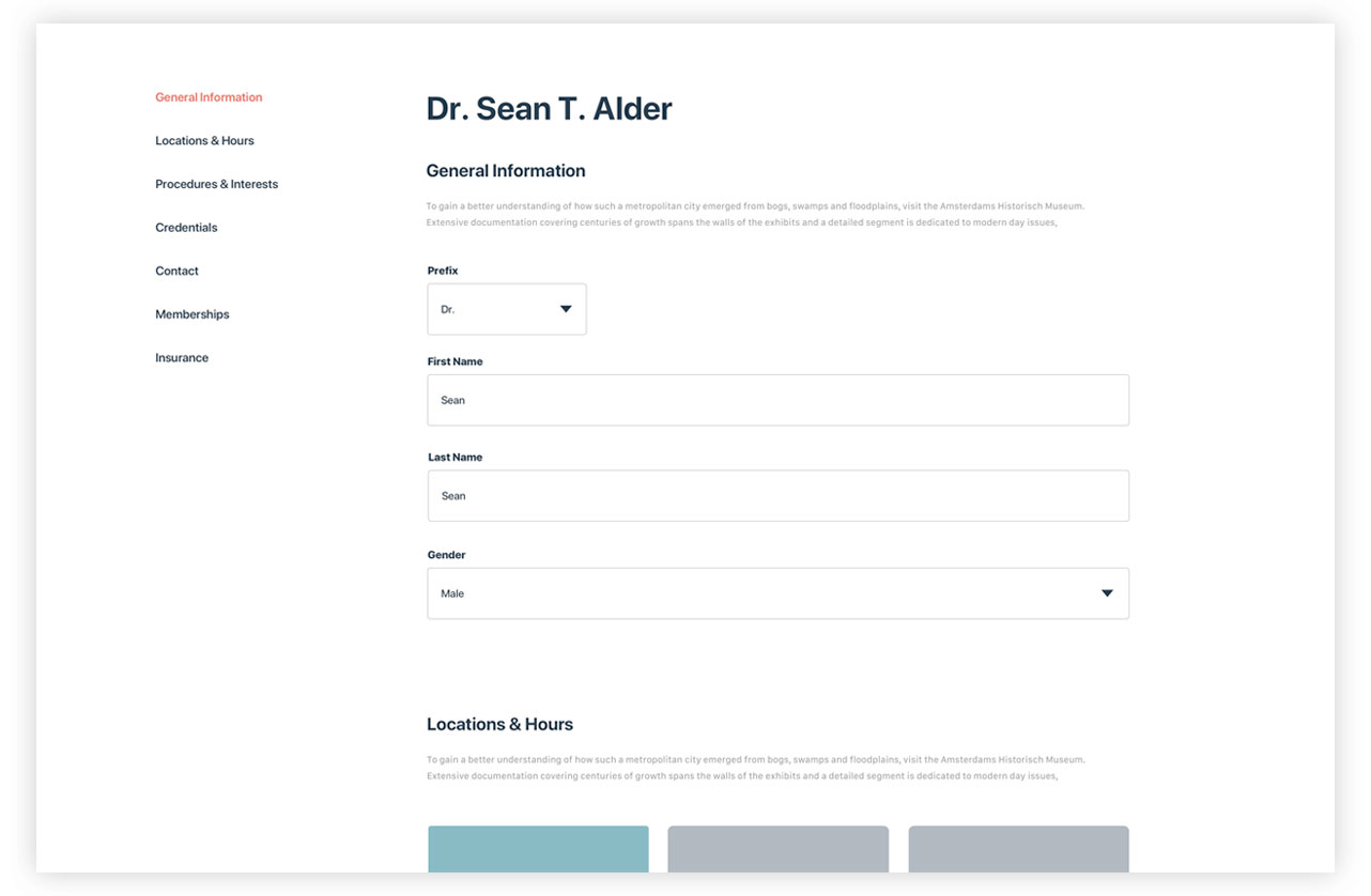
wireframes. prototypes. testing. repeat.
We took all of the work we had done thus far and put it to work with wireframes. Wireframes are designed to solidify the project requirements and define main layouts, UX workflows and content. They are easy to create and maintain, allowing us to quickly iterate on ideas, capture feedback from stakeholders and end users.
We moved the designs into Axure to user test the layout, interactions, and functionality. After repeating this process a few times, we were ready to move to visual identity.
Providing a consistent experience.
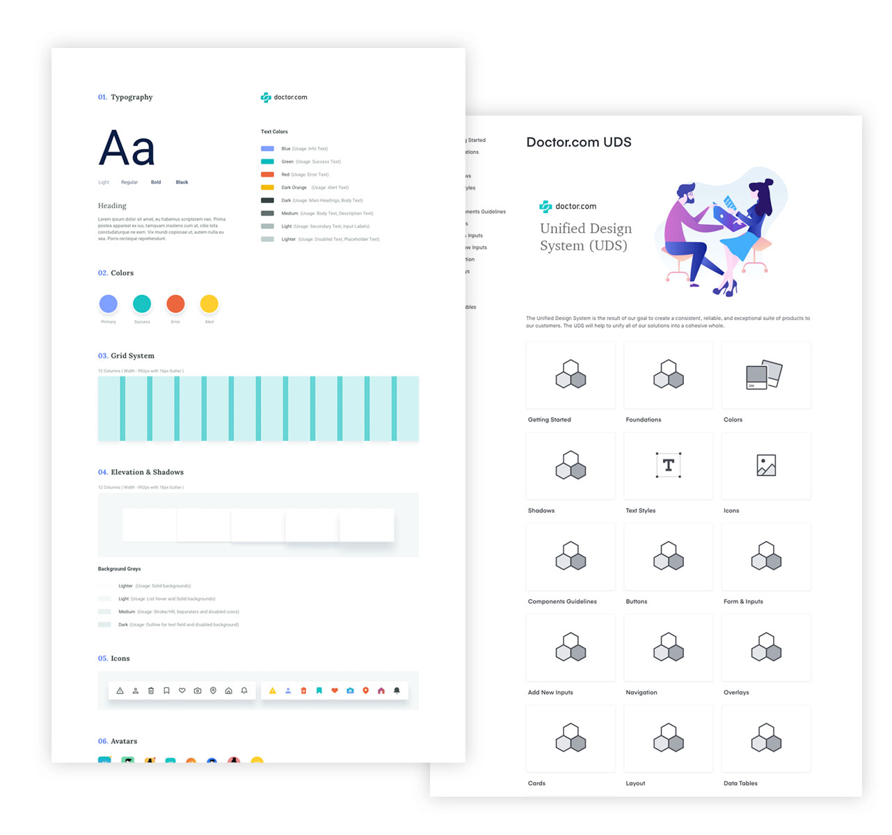
unified design system.
A design system is a collection of reusable components, guided by clear standards, that can be assembled together to build any number of digital products. This set of visual and language components is shared between teams to ensure a cohesive user experience. It is a single shared source of design truth throughout our organization.
Creating this shared system has allowed us to speed up design & development time, improve consistency & user experience, and promote accessibility.