
![]()
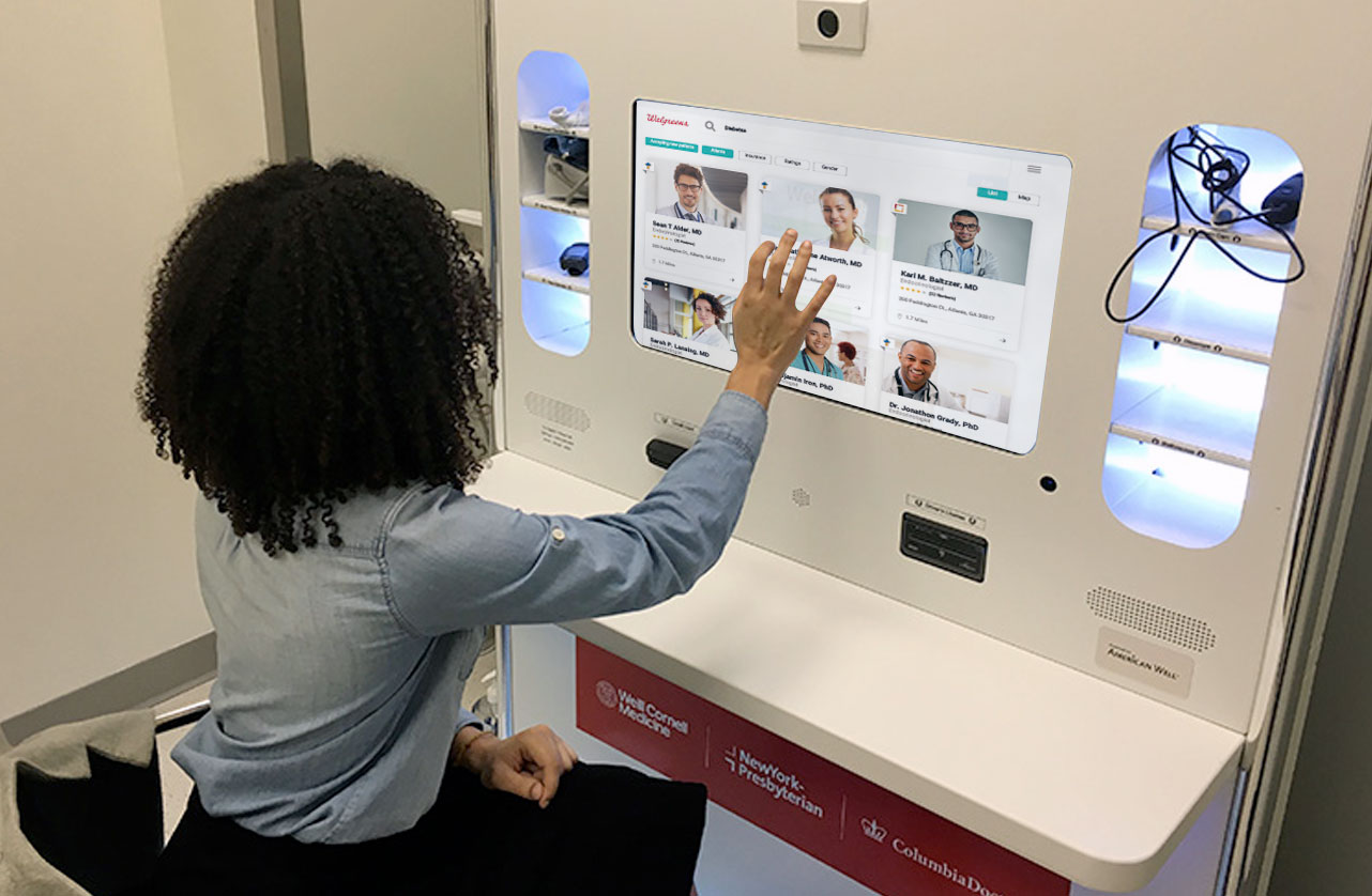
Kiosk and iPad application that allows patients to connect with the care they need.
ux research/testing, visual design, interaction design, prototyping
Many people use low-cost options like Walgreens urgent care for their basic health needs. But what happens when a patient needs more advanced care?

Browse by condition

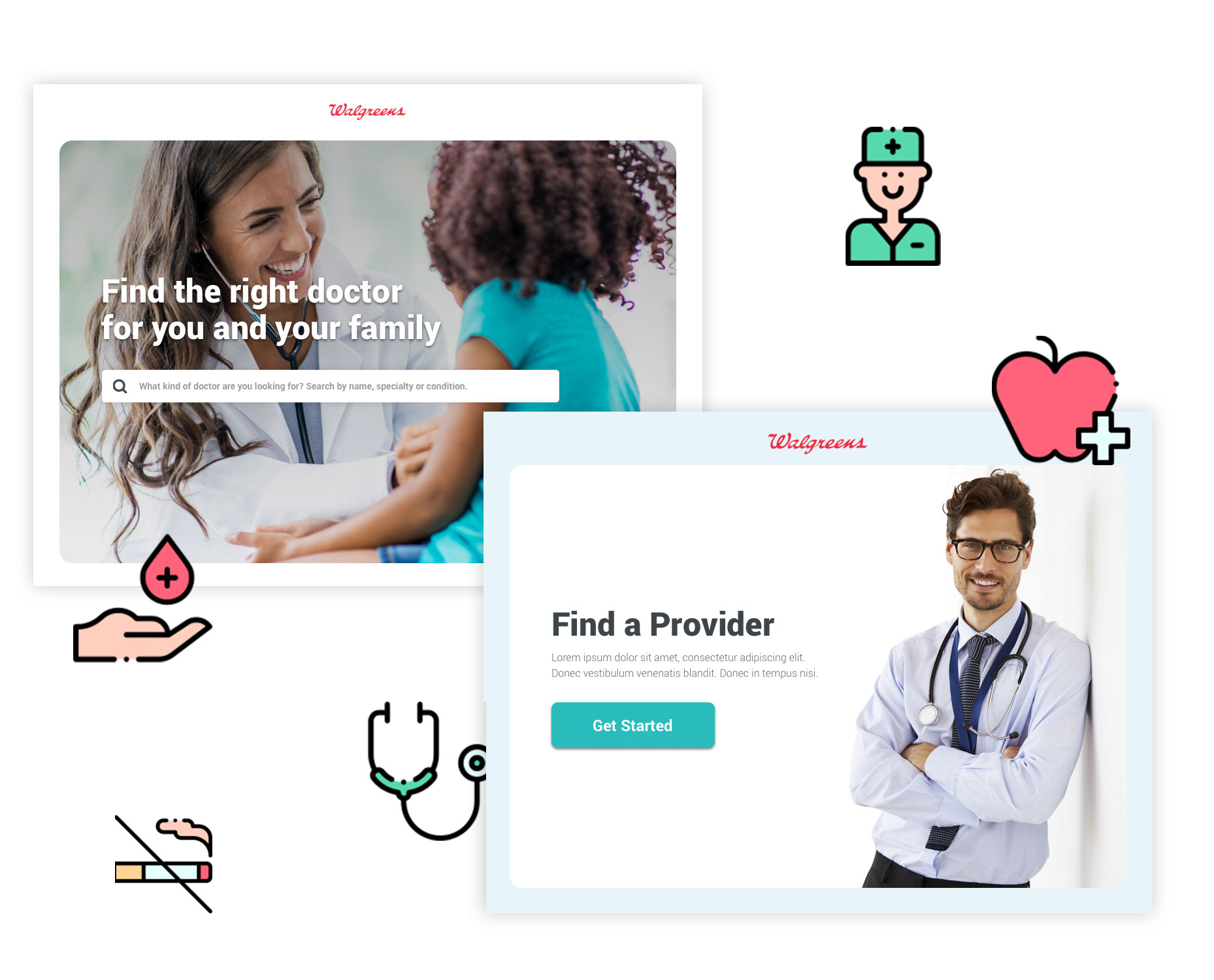
Search for Providers

Book an appointment
overview.
The idea is that healthcare orgs partner with Walgreens so they can get further “upstream” in a patient’s care needs. That way, when the patient needs something more acute from a specialist or PCP, they can already be in a relationship with them and guide those patients to a provider in their network.
We’d add value by giving them a partner-specific Find a Doctor tool with ratings and scheduling built in that could be pulled up on their desktop, tablet, phone or even the kiosks Walgreens has in stores and not only help make the referral but empower the patient’s research and choice process on the spot.
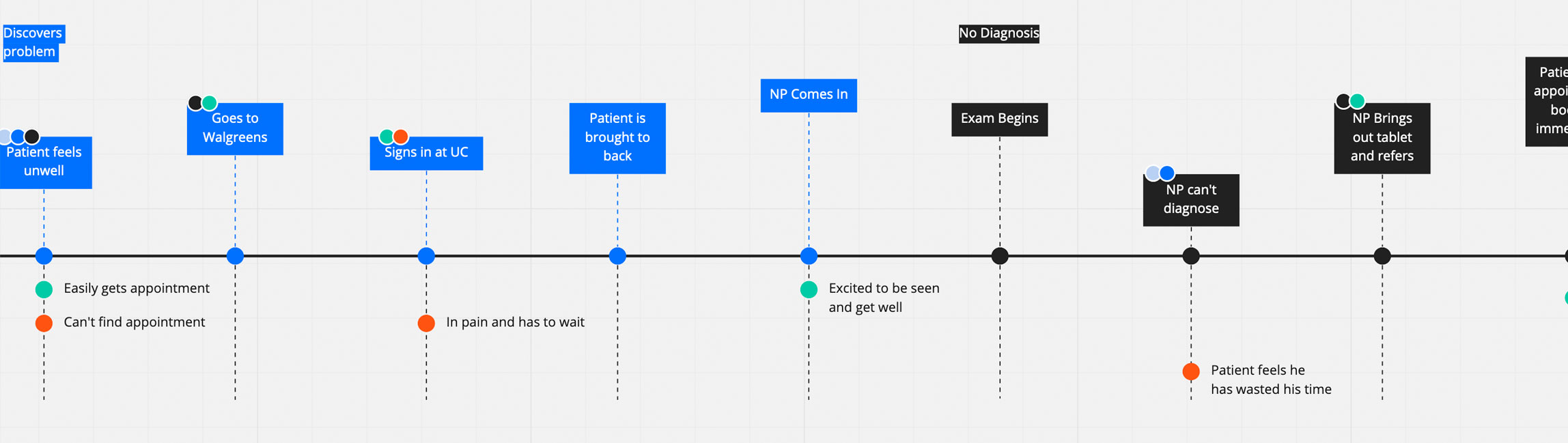
the patient journey.
Creating a seamless experience.
I went to local Walgreens to complete field studies before starting the project. This consisted of a mix of sitting in the waiting area and just observing patients, and conducting interviews with the nurses on staff. This allowed me to determine the journey that the patient would usually take when coming to a Walgreens.
lean ux canvas.
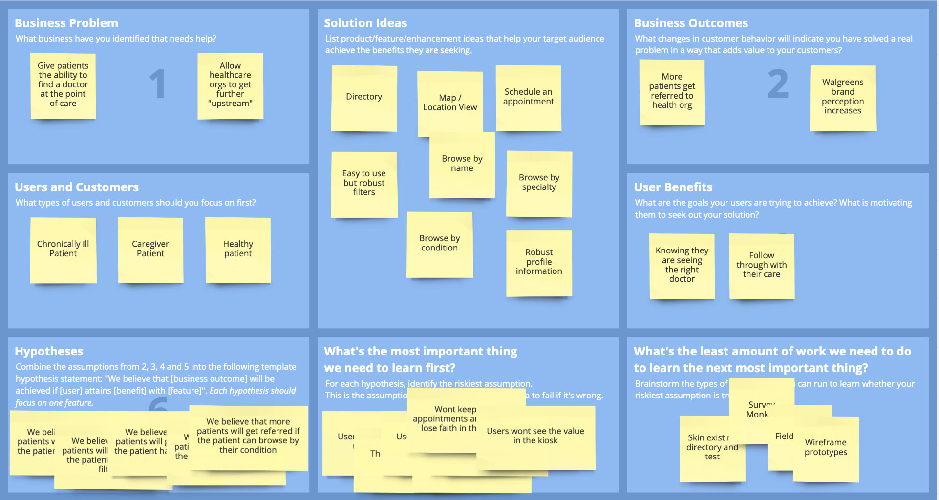
I held a kickoff meeting with stakeholders on the project. For projects like these I like to run a lean ux canvas exercise. The Lean UX Canvas helps teams frame their work as a business problem to solve (rather than a solution to implement). It’s especially helpful when you’re working with people that aren’t as mature in UX processes and design thinking.
“Design used to be the seasoning you’d sprinkle on for taste; now it’s the flour you need at the start of the recipe.”
— John Maeda
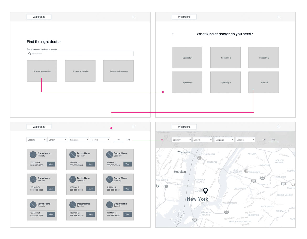
wireflows.
I love the combination of wireframes and user flows when I have an application that doesn’t have many unique pages. It allows me to nail down the path the user needs to take, iterate and test quickly, and walk stakeholders through my initial ideas.
During testing, I discovered that a guided/stepped approach worked better for our personas. They weren’t always the most tech-savvy and many had ongoing health issues. Large blocks and the ability to adjust font size were important.
visual exploration.
I tested a mix of iconography and imagery while determining final visual style. The bold colors and friendly iconography matched the Walgreens brand and tested as more welcoming and trustworthy.