
Shepherd
Identify anonymous visitors on your site and get their contact information instantly
ux research/testing, creative direction, visual design, interaction design
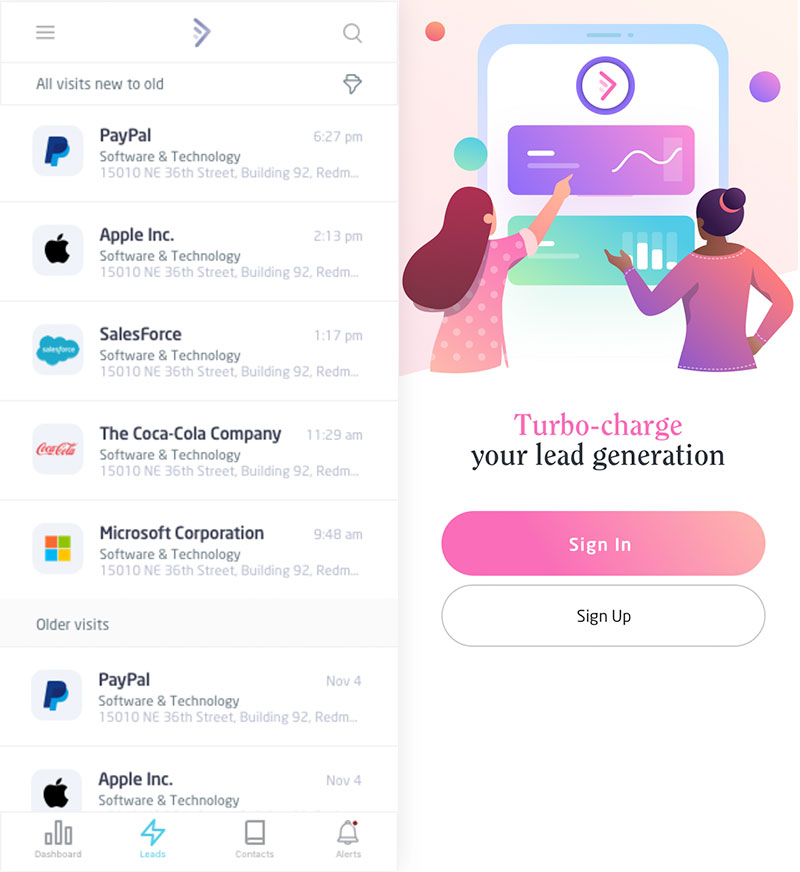
Shepherd is our code name for the Lead Forensics product rebuild. It is B2B software for turbo-charged lead generation. While working on their new branding, it became apparent that their product needed more than a visual facelift.


getting started.
I started off gathering as much information about their users as possible.
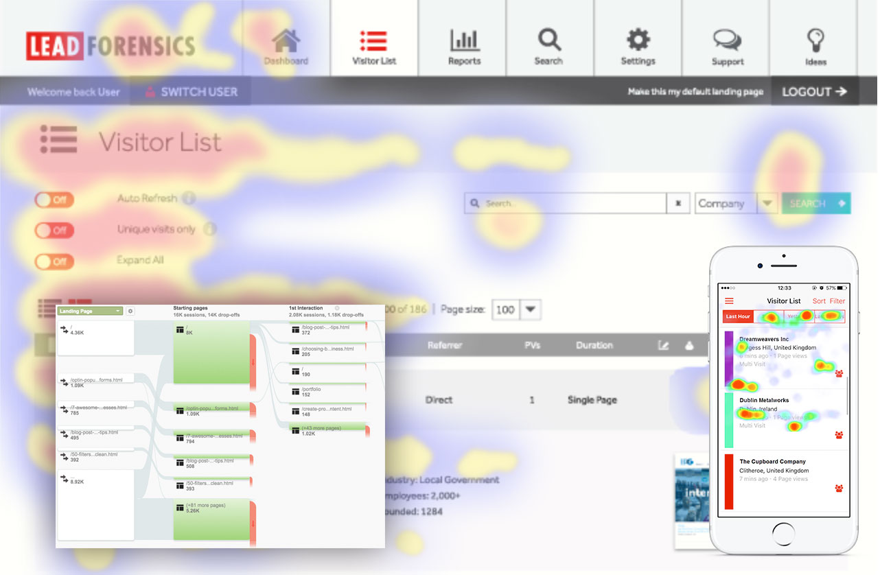
I already created user personas during the rebranding, now I created a full usability report of the existing system with a deep dive into:
- eye/click tracking
- analytics & user flows
- user, sales, and CS interviews
- user testing of existing software
information architecture.
Creating a better fit for the users’ needs and workflows.
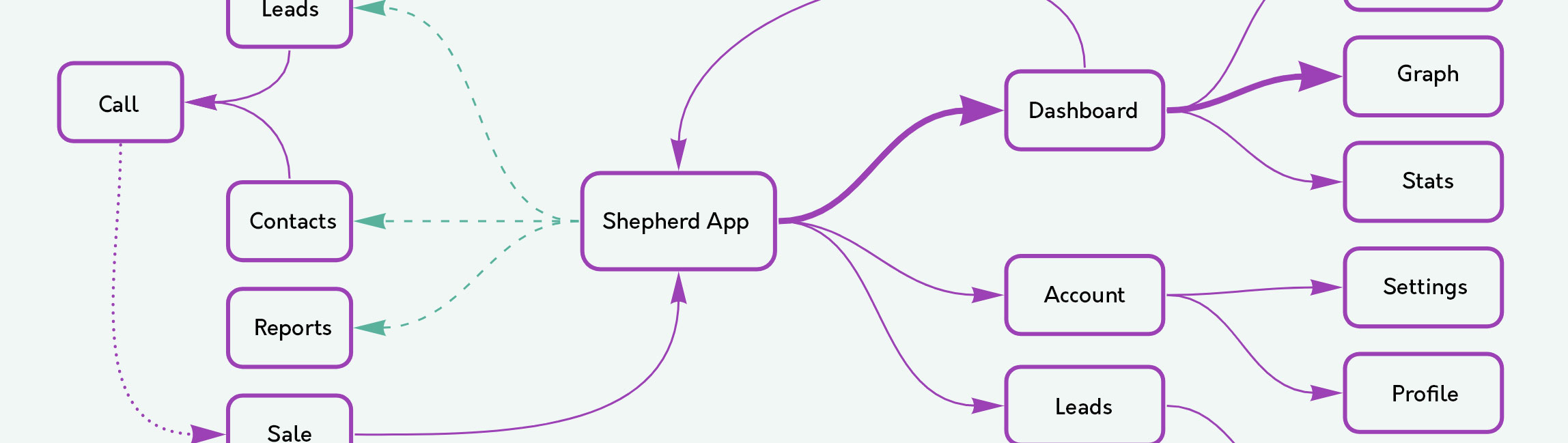
For this project, I created a mind map that gives a bird’s eye view of the system and shows relationships between its parts. This mind map exercise proved to be very effective when performed in collaboration with stakeholders. By visualizing overall project structure it is easier to understand the scope and define feature priorities.
A problem well stated is a problem half solved.
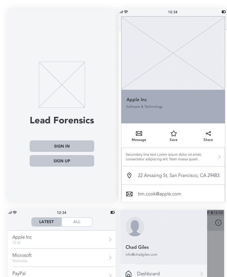
wireframes.
Create. Make. Iterate.
I love wireframes because I can quickly produce a set of options to discuss with the client, and once we agree on a certain solution I switch to high-fidelity wireframes, which take more time to create, but are more beneficial for the project in the long run.
Form should always follow function, but form should also take your breath away.
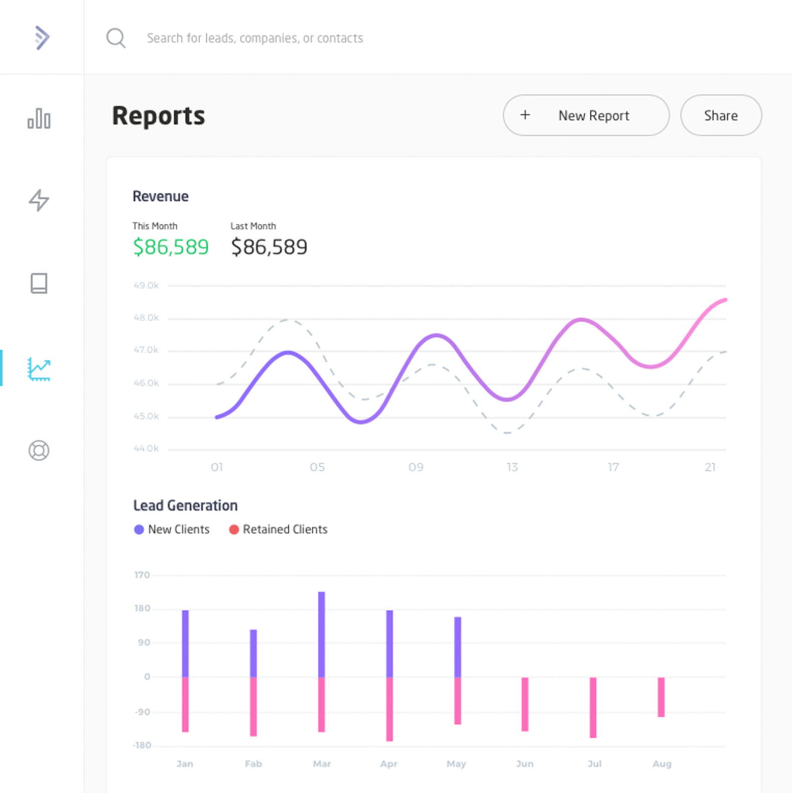
visual design mockups.
Create. Make. Iterate.
As I finalized the wireframes and workflows for the core features, I started working on the visual side of the project. Luckily, I had already come up with the new brand identity and was able to apply those colors, fonts, and assets to the new product. As users need to get to the information they need quickly and easily, I kept the palette minimal and used the bold brand colors to draw attention to important features, information, or functions.